


Wrapped with Meaning: Japanese Snack Packaging Secrets
The art of Japanese snack packaging extends beyond mere wrappers and boxes. It aims to enhance the snacking experience by emphasizing culture, beauty, and iconic symbolism. In this post, we explore why packaging is such a big deal in Japan and how different elements define the art. Feel free to use this guide to get snack packaging ideas that will add immense value to your next gift.
More Than a Wrapper: Why Packaging Matters in Japan

The idea of packaging as an art cuts across multiple aspects of Japanese culture—not just snacks. To Japanese people the process of opening the covering of a product is almost as important as enjoying the product itself. This belief affects consumer experience, particularly in the snacks, gifts, and fashion sectors. But what makes Japanese packaging unique, besides its perceived value? They have the following unique characteristics:
-
Attention to detail
-
User-friendly design
-
High-quality materials
-
Creative features and functions
-
High sustainability
Product manufacturers and consumers place great importance on packaging elements for multiple reasons. For one, imaginative product packaging helps to provide consumers a pleasant opening experience. They open items using just their hands and without the need for scissors or a knife, making the process feel more personal. Artful packaging also emphasizes the cultural respect for beauty and craftsmanship in Japan while increasing the commercial value of products.
If you want to present a gift in Japanese culture, no matter how small, the manner of presentation matters a lot. Hence, it’s vital for your gift’s packaging to feature the unique characteristics we mentioned earlier. The rest of our article will focus on the most important elements of Japanese snack packaging.


Disclaimer
×Bokksu is not responsible for the accuracy of the products’ nutritional or allergen information. Warning: California’s Proposition 65 may be in effect. For more information,visit www.P65Warnings.ca.gov.
Some Bokksu Market products are produced overseas and may have a Production Date printed on the packaging, rather than a Best Buy Date as is standard in North America. If your product appears expired, do not be alarmed! This is most likely the Production Date. All items have been double checked to ensure they are not expired and safe to eat.
The Kawaii Factor: How Cuteness Drives Snack Design

In the Meiji period (1868-1912), Japanese confectioners began to introduce Western-style sweets to the domestic market. To improve the appeal of these treats, they incorporated kawaii (cute) culture in their packaging design. Wrappers became more colorful and playful, with designs ranging from playful mascots to pastel palettes. The practice continues to this day.
Thanks to the kawaii factor, Japanese snacks like chocolate, biscuits, and gummies have cute characters as a prominent part of their branding. The bright illustrations and approachable nature of these mascots boost the snacks’ appeal across ages and borders. Hence, people from all over the world can enjoy them. They also evoke feelings of nostalgia in adults. An example of a popular kawaii mascot is Peko-chan of Fujiya, a famous chain of confectionery stores. Morinaga & Co., makers of Hi-Chew candy, have a mascot for their ChocoBall brand named Kyororo-chan.
Seasons on the Shelf: Limited-Time Designs That Tell a Story

Japan’s seasonal transitions affect snack packaging trends just as much as they affect the local cuisine. For example, in the spring, limited-edition designs often focus on themes related to sakura (cherry blossoms). Images of maple leaves are shown in fall, while summer designs may feature chestnut depictions.
These colorful patterns are used to celebrate nature and the aesthetics of its changing seasons. Unlike generic motifs, they add emotional value to packaging, which resonates with the people who handle them. As a result, the special seasonal boxes, wrappers, and covers that adorn snack items are often collectible.
Symbols and Meaning: Hidden Messages in Japanese Design

One of the most intriguing aspects of Japanese snack packaging is the hidden meaning behind some of the images they display. Often, manufacturers and artists include imagery that doesn’t just look beautiful but also adds symbolic value to their work. To the average snacker, design colors and motifs hold no underlying interpretation; however, Japanese consumers often decode these instantly. The list below unpacks the most common cultural symbolism in snack packaging:
-
Cranes: Longevity and good fortune
-
Waves: Luck
-
Green tea leaf: Ceremonial culture
-
Maneki Neko (the beckoning cat): Good fortune, protection, and wealth
-
Koi (carp): Strength, success, and determination
-
Bonsai: Balance and harmony
-
Samurai: Respect, loyalty, and honor
-
Color gold: Power, mercy, and the sun
-
Color violet: Strength and nobility
-
Color blue: Mystical life
Form Meets Function: Clever Shapes and Smart Engineering

Already famous for their technological innovations, Japan is also known for ingenious package mechanics. These containers serve health, preservative, accessibility, and convenience functions without batteries or active chemicals. Below, we’ll reveal some of these clever designs and how they elevate the snacking experience.
-
Pop-out trays: Small snack trays that allow you to push out candy or gummies with simplicity. Simply push the bottom of a tray for the snack to pop out.
-
Resealable pouches: Low-price containers need no introduction. They are used to keep perishable things fresh. You can open the pouch, take some of the snacks out, and reseal it.
-
Dual compartments: Small boxes with two compartments that contain different snacks from the same manufacturer or curator. They allow you to better organize your snack storage space.
-
Box dispensers: A portable candy box used to store and dispense sweets or gum on demand. It typically features a carefully sized slot enclosed by an openable tab. Mintia Breeze uses this design to help a person control the number of mints they can pour out at once.
-
Ridged bottles: These plastic bottles have ridges around the neck area to allow deflection of direct sunlight. The design is often used in order to maintain the freshness of bottled tea.
-
Raised lip cans: Some soda cans come with a raised lip, which offers better grip and eases the can opening process.
-
Peelable lids: Manufacturers sometimes make the entire lid of beer cans peelable, allowing you to safely drink from it like you would a cup.
-
Braille packaging: Some products have Braille inscribed onto their packaging to make their products more accessible to the visually impaired. The plan is to help the blind shop and search for products more effectively. They can read important information like brand names, descriptions with ingredients, sweet or sour flavors, and alcohol quantity.
Character-Driven Branding: From Anime to Regional Mascots

Collaborations between anime characters or local mascots and snack brands to make packaging are a common practice in Japan. The designs that such partnerships create often add playfulness and emotion to everyday snacks because of how much people love these characters. Examples of popular anime with their characters on snack packaging are Demon Slayer, Neon Genesis Evangelion, and Pokemon.
Bokksu Snack Box has created all kinds of collaboration boxes for people who watch anime, including lovers of Hello Kitty and Friends. We’ve also curated several boxes that featured local Japanese icons. For example, the Oshogatsu Fortunes box includes package imagery of the iconic Maneki Neko (the beckoning cat).
Texture and Touch: Multisensory Packaging Details

The feel and texture of Japanese wrappers are just as important as their aesthetics. After all, one of the main purposes of the covers is to add to the unboxing delight. Some designers use tactile elements like embossing, washi (traditional Japanese paper) textures, bamboo material, and soft-touch finishes to engage senses other than sight.
Snack packages can sometimes be designed to mimic the texture of natural elements like fruits or plants. Also, multisensory packaging may engage senses of smell, sound, and taste. All of these combine to create a unique brand experience even before you’ve taken your first bite.
Omotenashi in Every Box: How Packaging Reflects Hospitality

The concept of hospitality, and sometimes mindfulness, is known as “omotenashi” in Japan. Steeped in traditions of the Japanese tea ceremony, this concept preaches that care in presentation is a form of respect. As a result, it inspires major packaging styles and practices in the country.
Based on omotenashi, brands ensure that their package design reflects careful attention to detail, thoughtfulness, heart, and aesthetic precision. And it’s not just brands. Omotenashi is the ideal practice for any gift giver. At Bokksu we apply the same meticulous dedication when designing all of our snack boxes. Each box is curated with the utmost care, using premium packaging styles that showcase Japanese traditions.
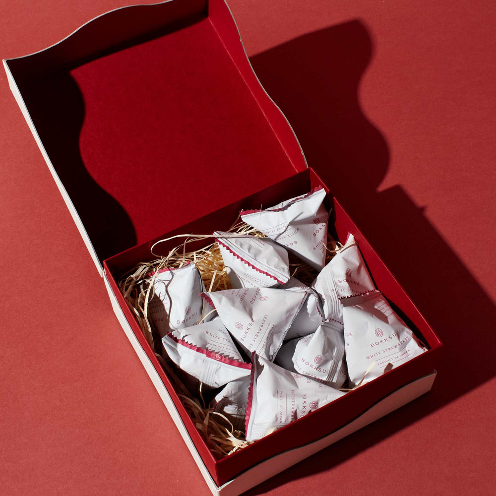
A Collector’s Dream: Why People Save Japanese Snack Wrappers

There is a rising trend of collecting Japanese wrappers. Collectors save them as part of their journals or add them to scrapbooks. Others simply display these special covers. Thanks to limited-time package art, people are finding it more and more appealing to collect snack wrappers and boxes. The trend has turned snacking into a fun and memorable activity for people of all ages. Bokku’s frequent releases are a great example of how rotating monthly themed boxes enhance the appeal of packaging all year long.
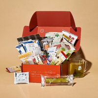
Bring the Aesthetic Home: Subscribe to Bokksu Snack Box
Experience beautiful snack packaging firsthand with Bokksu. Every month, we will send you a box filled with a variety of Japanese treats, from rare Pocky to premium teas. These boxes and their content are curated based on a specific theme, which changes with each new month. We also ensure that we design each box with unique, exotic, and symbolic art, in keeping with Japan’s omotenashi traditions.
Our ever-changing selection of new snacks and their thoughtful presentation make us the perfect source of all your unique snacks. You can use them for personal enjoyment, collecting, or gifting. Get yourself a Bokksu Snack Box Subscriptiontoday, and we’ll ship you a meticulously crafted box of delicious treats every month.
We also offer a page dedicated to past themes where we provide checkout for snacks in previous boxes, including the snack box for June 2025.

Disclaimer
×Bokksu is not responsible for the accuracy of the products’ nutritional or allergen information. Warning: California’s Proposition 65 may be in effect. For more information,visit www.P65Warnings.ca.gov.
Some Bokksu Market products are produced overseas and may have a Production Date printed on the packaging, rather than a Best Buy Date as is standard in North America. If your product appears expired, do not be alarmed! This is most likely the Production Date. All items have been double checked to ensure they are not expired and safe to eat.
-
Trending Posts

-


Author Bio
More from the blog
View all


